Solarclarity
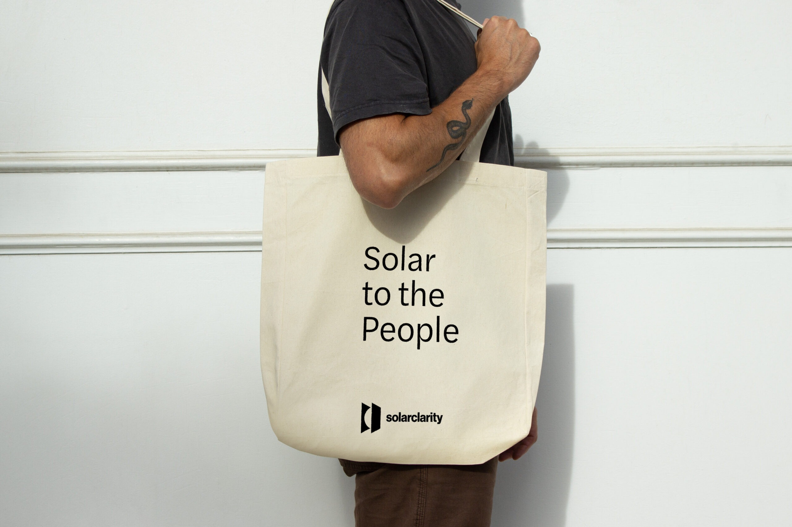
Solar to the People
Solarclarity
Solar to the People
Solarclarity
Solar to the People
Solarclarity
Solar to the People
Solarclarity
Solar to the People
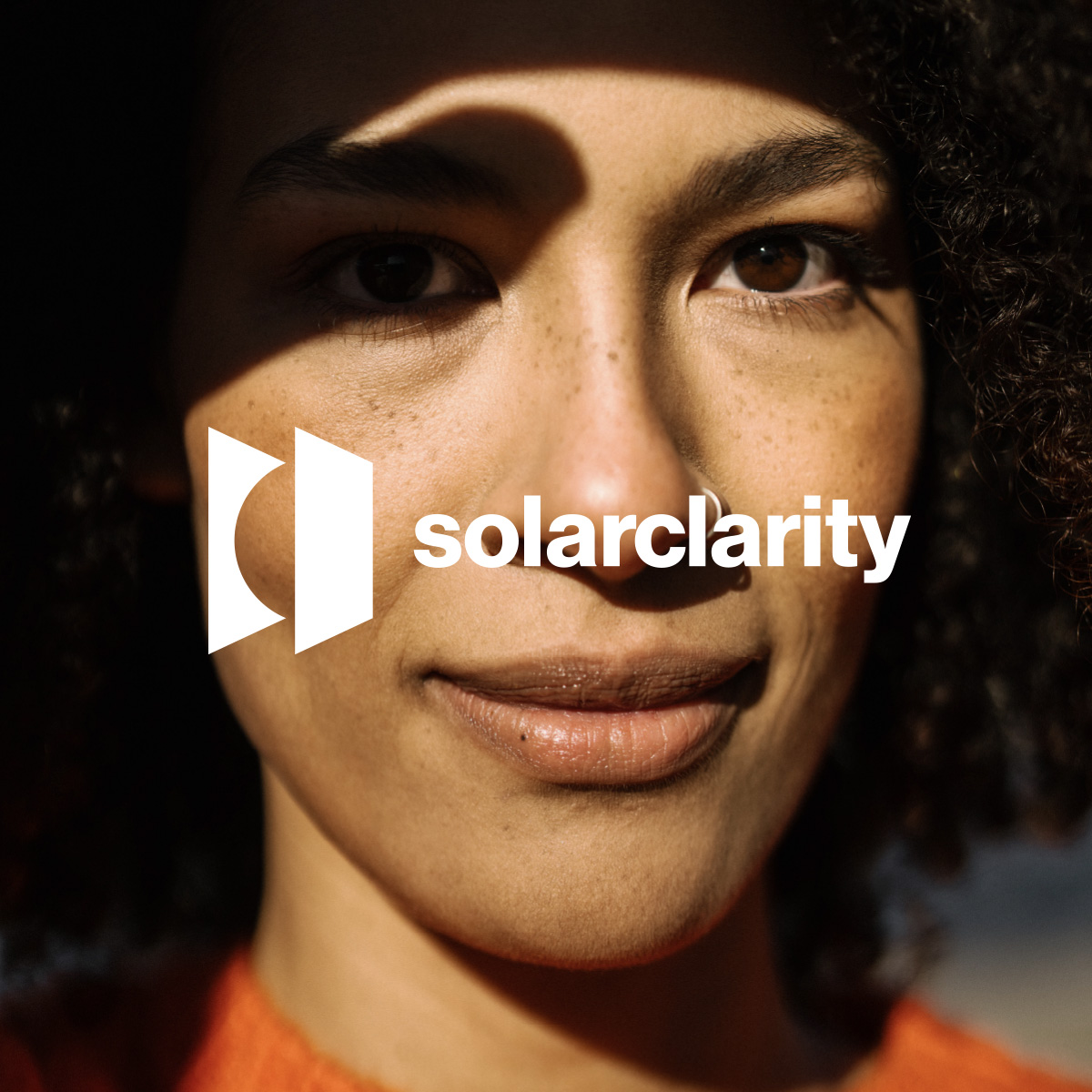
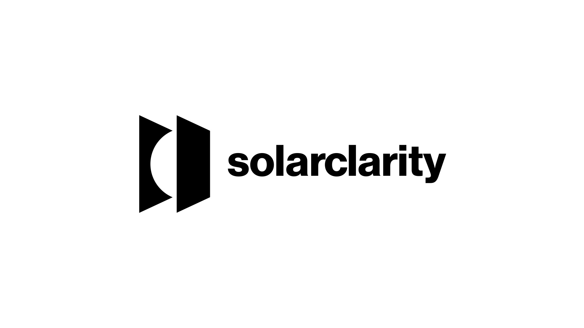
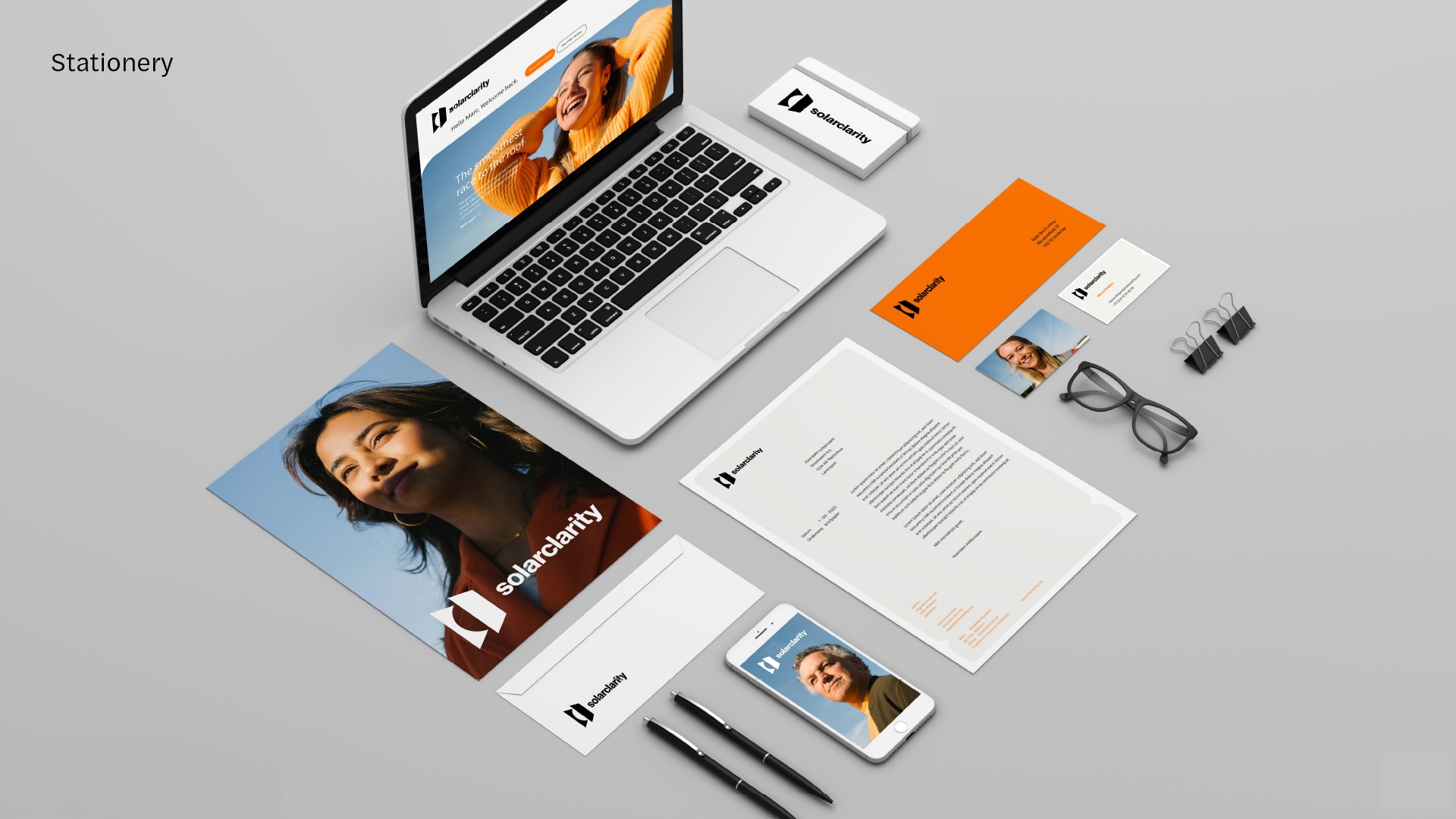
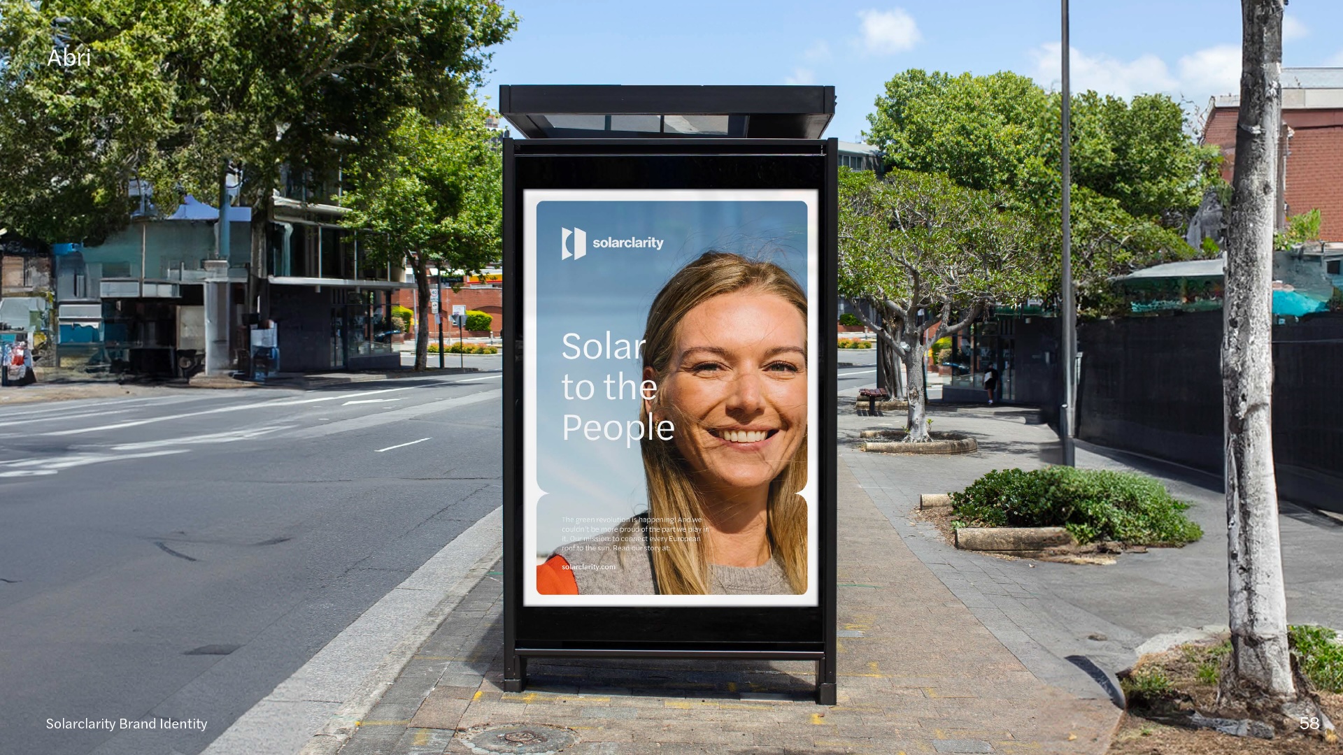
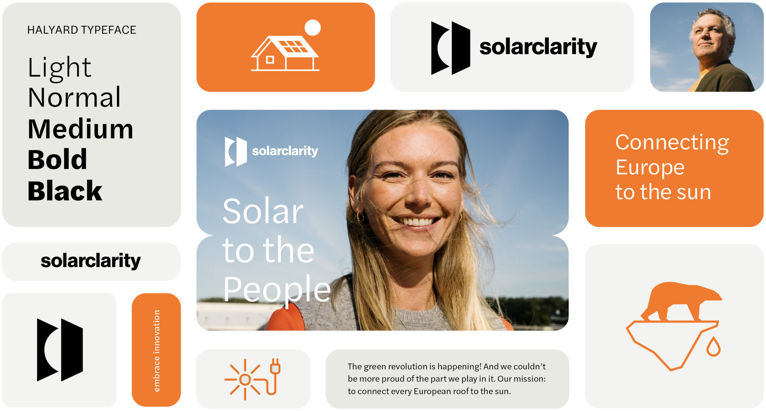
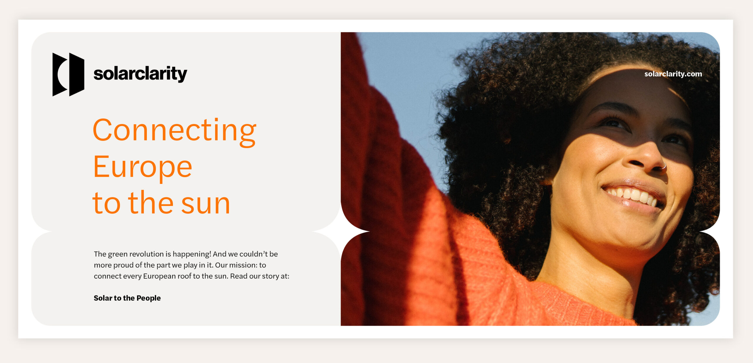
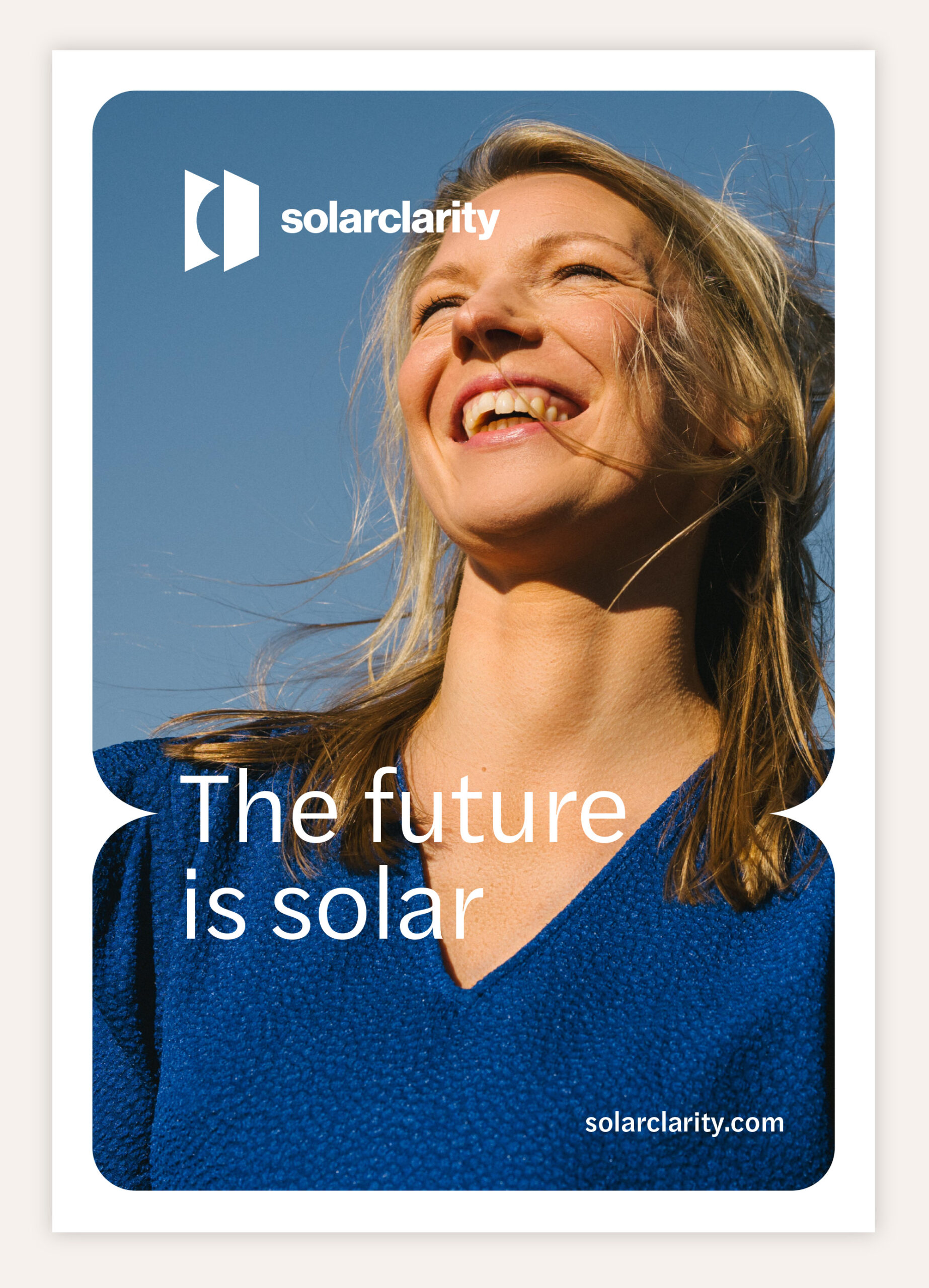
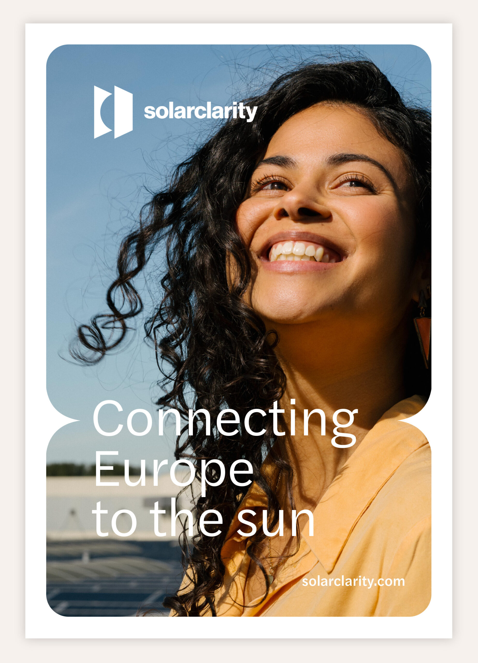
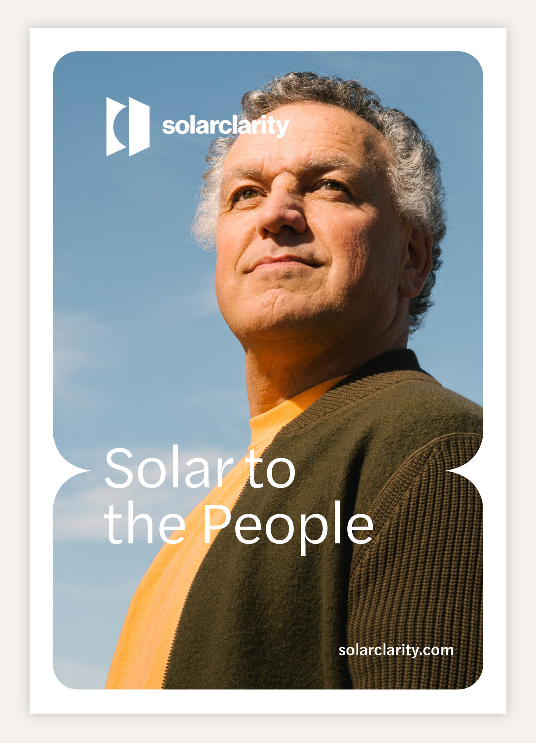
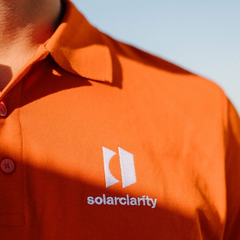
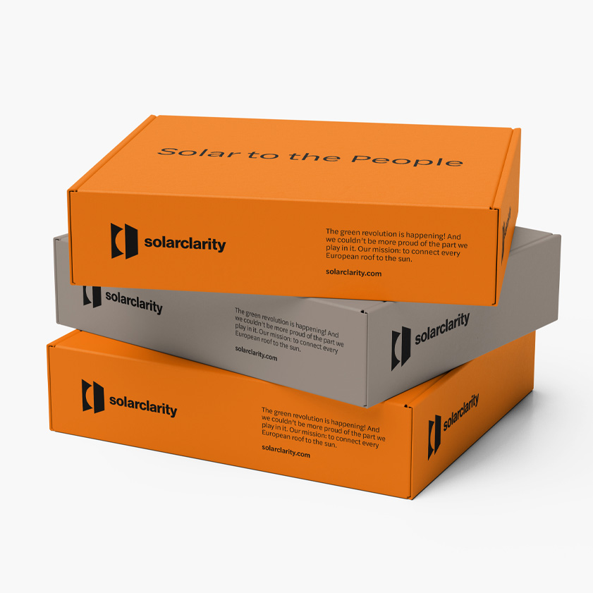
Solarclarity is on a mission to power up every European rooftop with the sun's energy. We created an entirely new brand identity fitting the strategy, including a new icon, fresh photography, a fresh typeface, and guidelines for a distinctive identity.
The icon is showing the sun held between two solar panels. It also represents moving forward, kind of like a fast-forward symbol for progress. In all visuals, the sun takes center stage, showcasing its impact on people and the warmth it provides. The ultimate goal is simple: To bring Solar to the People.
CREDITS
Designed by - Ralph Booms
Client - Solarclarity
Photography - Rutger Geleijnse
Illustrations - Natalia Jiménez Osorio


-
-
Selected Works

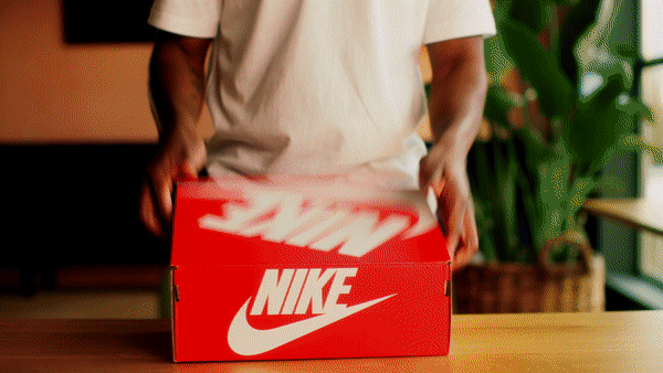
Denim SolarCreative Campaign

Proud to be BoringCreative Campaign

SolarclarityBrand Design
IntersportService Supplied
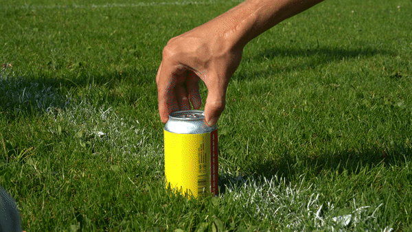
Poesiat & KaterWorld Cup Activation
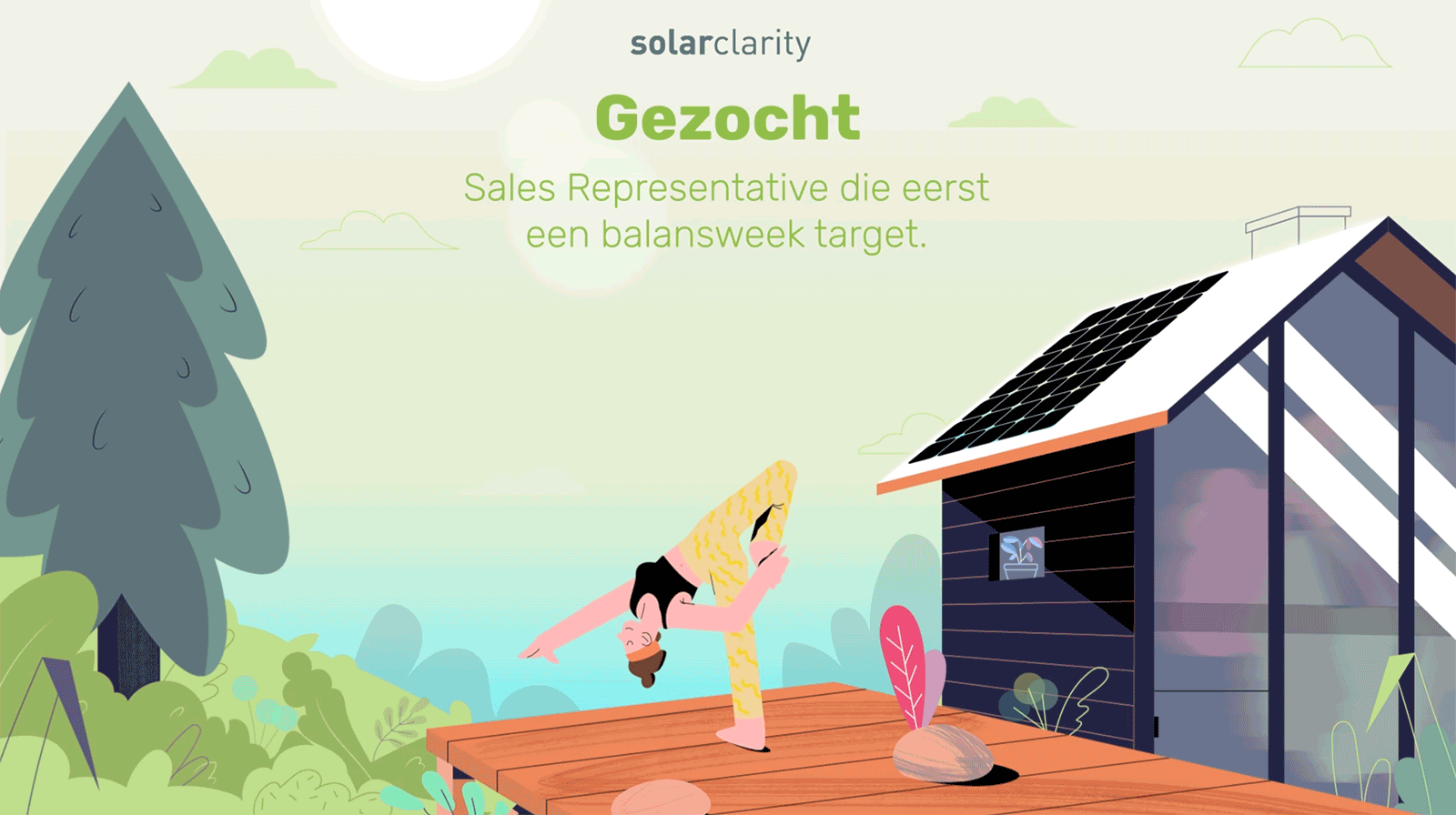
SolarclarityRecruitment campaign

BluemovementService Supplied

Round11Brand Design
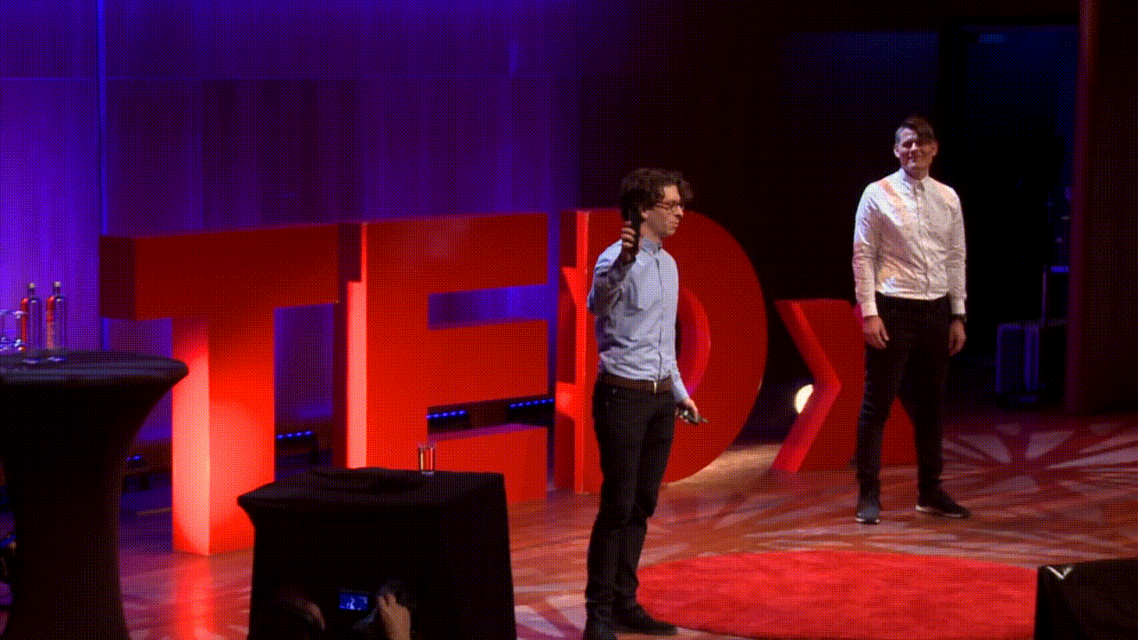
Previous workCreative


Subscribe
This Newsletter
Stay up to date with This news.